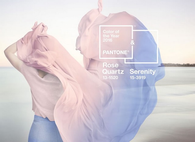
It’s time to say goodbye to 2015’s beloved Marsala and say hello to the new Pantone color of the year. Except this year for the first time ever, its two colors! Rose quartz and Serenity are what you would probably liken to cotton candy pink and blue, which we can all agree is an interesting choice. According to Pantone, the 2016 colors were chosen to provide a sense of calm in the midst of our chaos. When combined with each other Rose Quartz evokes a soft, romantic feel resembling a beautiful flower or the setting of the sun, while serenity brings a calm tranquility with hints to the water. Together they provide a balanced palette that can evoke a range of emotions, but how do they relate to the everyday person?
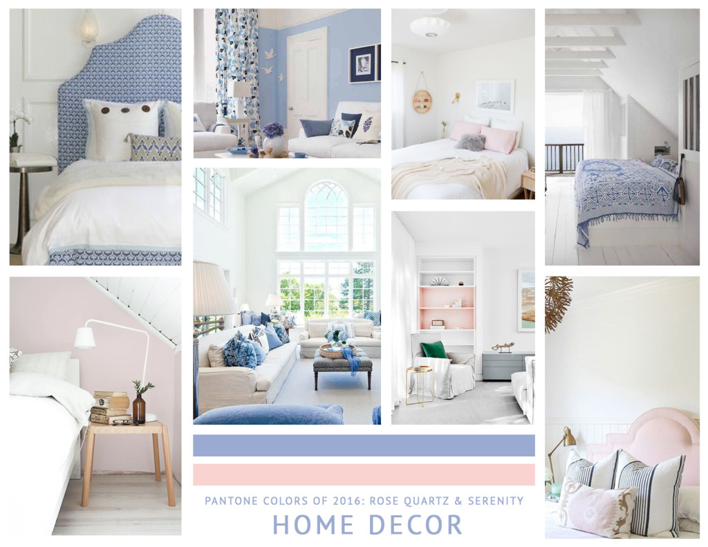
I have to say, the 2016 colors of the year would not be my first pick for home decor by any chance. I am a strong anti-pink girl, myself, and would probably shy away from a pink and blue color palette even for my future children’s nursery. However, there are some subtle ways to integrate these colors into your home this year. I would recommend using these colors as accents through accessories like blankets and pillows, or make a bold statement through accent walls and bed frames. Just make sure to keep a good balance of white in the room or ground the colors with darker wood toned hues! When used subltly, these hues bring a soft elegance into spaces. Check out these inspiring spaces to get you started.
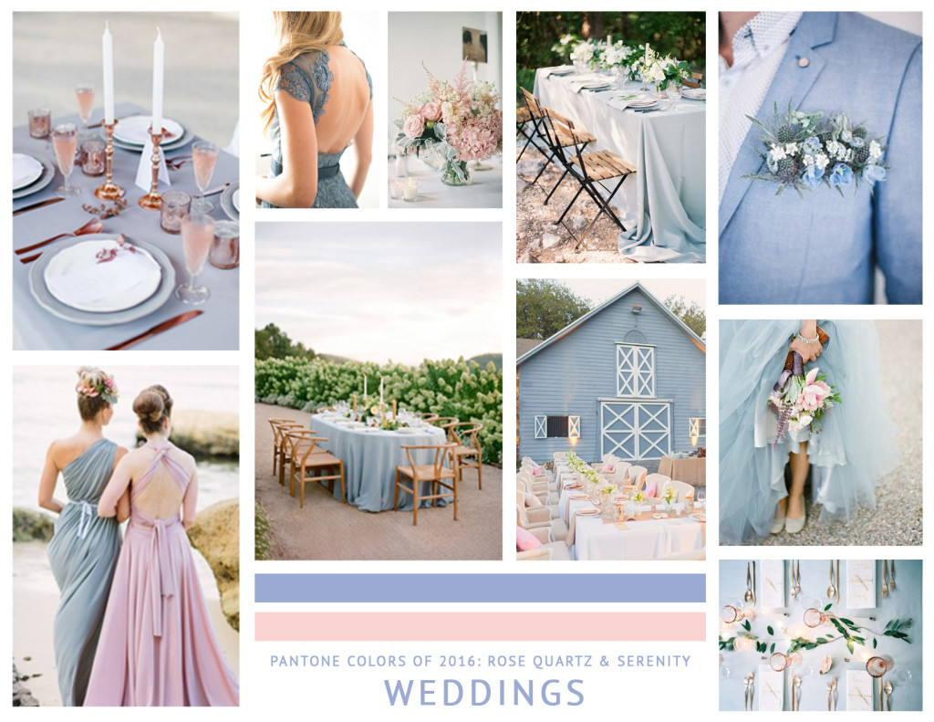
One place I strongly believe rose quartz and serenity will have the most impact is on the wedding industry, and this is where I am most excited to see the magic play out! With the science behind color and its ability to evoke emotions within people, rose quartz and serenity become the perfect pair to set the tone for a romantic affair. Best of all? Tim and I’s close friends, (turned bridal party attendants for our July wedding last year) are getting married this April and we are along for the ride! I am so excited to help mix these beautiful colors into their spring wedding and share all of the details with you guys! I already know its going to be absolutely incredible.
 So before you completely rule out your childhood bedroom shades, take a pause and pull small parts of Pantone’s 2016 color(s) into your life this year. Whether its a new pillow in your home or one shirt in your closet, the goal is to create tranquility in your life in the midst of the craziness. Plus, no one ever said we had to be like the NY Fashion week models and where pink and blue from head to toe! You definitely won’t catch me doing that . . . .
Any other suggestions for integrating Rose Quartz & Serenity into 2016? Share them with us in the comments below!
Click here for image resources and more inspiration.

So excited !!! Love you!