Hey Friends! Today I thought I would share some of the background behind my website branding and color scheme. I am by no means a graphic designer and can’t wait to keep improving my site, but with my interior design background I think I was able to fake it until I make it (but don’t tell anyone!).
When choosing a starting point for a personal brand, its always good to look at your day to day surroundings. Many times, especially as a designer, its hard to narrow down your own aesthetic and stick to it. I first began by looking around my house, closet, and then my pinterest boards! What are my favorite things? Pins? Colors? This helped me to narrow down a couple characteristics that were constant throughout.
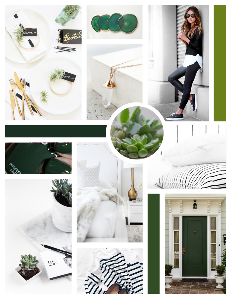
- GREEN: The first thing I noticed was green. I love nature (from afar) and green has always been my favorite color but I tend to shy away from it in home decor and my closet. My Pinterest however, is littered with green from my obsession with succulents, to party planning and even nail polishes. I decided it was finally time for me to do something with this “favorite” color of mine.
- STRIPES: The second thing that was prevalent in my searching was stripes. Almost my entire closet is filled with different striped items and black and white stripes are my go to for office and paper goods. I love how the mixing of sizes can drastically change the impact of the pattern from a very masculine tone to soft and feminine. Plus, stripes go with everything! (At least in my opinion)
- GOLD: I don’t think I am the only one who currently has an obsession with gold? My mom always likes to remind me how much I hated gold when I was younger, but for some reason I have had a complete turn around. My phone case is gold, my Starbucks cup is gold, and honestly I could probably fill this post with everything that I own that is gold. It seemed like a good decision to put gold in my color scheme. I don’t think I will regret it.
- WHITE TEXTURES: The last thing I pulled in was white and soft textures. Throughout design school I have always been a fan of “white space” and soft patterns and textures like marble, and fur. I love how everything seems to pop on a white background. Especially when mixed with patterns and textures, a color scheme can take on a whole new meaning
Once I noticed these key traits, I began pulling images and created this mood board to help guide the design of my website and keep things true to myself. Let me know what you think in the comments below!


